Friday 18 February 2011

capture blog links

Stage 1: Investigating past and current practice in capture
http://donachiecapture.blogspot.com/2010/10/3-ways-of-capture.html

Stage 2: Planning yourcapture
http://donachiecapture.blogspot.com/2011/01/dreamweaver.html

Stage 3:Exploringandexperimenting
http://donachiecapture.blogspot.com/2010/11/wall-rubbings.html

Stage 4: Completing your capture work
http://donachiecapture.blogspot.com/2011/02/website-layout.html
http://donachiecapture.blogspot.com/2011/02/website.html
Stage 5: Reviewing your own work
http://donachiecapture.blogspot.com/2011/02/evaluation.html

Evaluation

Evaluation 
The capture unit assignment I was given was to create a website of my choosing and include different ways of capture. I chose to recreate the George White motorcycle website because the layout and structure of the website was quite poor and I thought I could make it better. I started out do a bit of research on other motorcycle websites to see what works well and what doesn’t and also to see what I could include in my website. There was one thing that some sites had that I thought was a really good idea and that was a 360 rotation of the bikes, I have incorporated this function in my site. The way I did this is by taking 21 pictures around the bike so that there is a full rotation around the bike. Another way I would I capture the products on the website is to draw them, I saw this idea on a website and thought that It would look different.
The first thing I started with when I created the website was the logo. I came up with a few different concepts and ideas but they all had too much happening in them and didn’t really fit the criteria of a logo. I feel that the logo I chosen is the right one. It is simple, easy to read and is effective. Once I had the logo out the way the next step was the layout of the site and the structure of the content. Looking through the research I did I notice that all the good websites had really basic layouts so that it was easy to navigate through the site. The layout for my site has the same layout on all the pages so that it is consistent throughout.
If I had to do this capture unit again the thing I would do differently would be to do more research on different photographers and artists and learn to use the software’s a bit better to make the task easier. The parts I think I have done well in is the research of different website and understanding good points and bad points.

website


Tuesday 1 February 2011

3D Photoshop


The fist step is to find an image and open it in Photoshop. Then duplicate the layers and name the top one blue and the bottom one red.Once you have done this delete the background layer.Select the blue layer and go image, adjustments and curves then change the channel to red and put the out put as 0 and the in put as 251 and click OK. Then select the red layer do to image, adjustments and curves, change the channel to green put the output as 0 and input as 251, once you have done this change the channel again to blue and put the output to 0 and the input to 251 and click OK. once this is done select the blue layer and set it from normal to screen. After this you can adjust the image left or right to make it 3D.

wordle

Wednesday 26 January 2011

Tuesday 25 January 2011

Dreamweaver


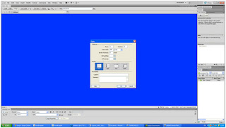
 This is a quick demo on how to add a table, text and a link to another page. The first thing i did was to make a root folder and save it.when you open dreamweaver and selected html once you have done this go site then new site and a window should open, when this opens give your site a name and save it in your root folder.


To change the colour of the background go to the bottom of the page where it says page properties.
in the page properties it should say appearance (HTML), then there is a box next to background click it and select the colour you want.

To insert a table go to insert, table or ctrl,alt,T. after this a window will open were it will allow you to edit the table.


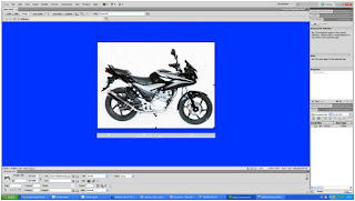
To insert an image in to the table find the image you want and save it in an images folder in the root folder. once you have done this click in the cell you want the image to go in then go insert, image and then find your image.


To link two pages create site like the once you already have, save it in a root folder then go insert, hyper link and then browse for your folder.

Wednesday 19 January 2011

website research

Website research

What to look out for
·         Layout (button location ect)
·         presentation
·         Usage
·         information

Home page has too much information. This is only half of the main page; I think that the sales information should have been put on another page just to spread it out. The website is very easy to use and navigate though, all the buttons work and take you to the correct page. There is not enough information about the products on this website. George white does advertise their new and improved website on the old one. The one thing that really stands out on this website for me is the font for the buttons; the fonts for the buttons are the fonts for the motorcycle companies. The new George white website has a new layout for the buttons and a new look all together.


·        

J&S
The layout for this website is very basic and easy to use also the website has sub categories for different deals so you don’t need to go and look through the whole site to find what you want. The information given on this website is very detailed and descriptive. Along the side of the website there is a latest added to the used bike section and I think that is a very good feature and there’s no hassle of searching through list. At the bottom of the page there is an advert for the new Kawasaki coming out and the link takes you to the official Kawasaki website. The bad thing about this website is that there is nothing on this website that catches your eye. The only thing that does attract you is the advert for the new Kawasaki and it advertising it for another website.


Damerella

Damerells is mixture of the George White website and the J & S website. In my opinion this is the best website out of the three because it has everything ready for you on the home page without looking untidy and everything is in categories. Another good point about this website is that it is the only site out of the three that you can buy products. One quite crucial point about this website that it only sells Yamaha and Honda products but they do cover all types of bikes (cruiser, street, sport touring ECT). As a site by its self it is very easy to navigate through and find what you want. This is also the only website that uses scrolling adverts; I think I will probably add scrolling images on my website.The information given on this site is very detailed on every bike ranging from available colours, technical specification and general information. 

Tuesday 18 January 2011

Wordle


The task I was given was to describe myself in words and make a poster with them by using the website wordle.net. Once I had all the words that I chose to describe myself the website jumbles them up, you can then change the layout ,font  and colours of you poster.


The second task was the same only for someone else in the class. After we each did our posters we had to make one for the row. the last step was to cut them out and put them all in a frame to go around the class.

Sunday 16 January 2011

advertising

Guerrilla advertisement

Guerrilla advertising is unconventional ways of promotion, some guerrilla marketing campaigns are unexpected and sometimes interactive. The adverts tend to be in really random places.
Guerrilla marketing is mainly aimed for small business, Instead of money the primary investments of marketing should be time, energy, and imagination.

TV advertising 

TV advertising is one of the most popular ways to advertise products for companies and probably the best way for a business to get noticed. Adverts are normally around 30 seconds long. The purposes of a TV advert are to grab the audience and persuade them that they need to have your products. For example the iphone 4 advert shows of the new features of what the phone has (facetime, gyroscope, multitasking ect). And because your phone doesn’t have that it makes you want it.

http://www.youtube.com/watch?v=a5cgiFttbsQ this is a TV spot for facetime showing the different audiences that the iphone 4 is aimed at (everyone).

Magazine advertising 

I chose this advert because it is so simple but yet very effective. The advert is 90% picture and 10% text and information, the five words on the image is the bits that sell this bike to me. The image is really trying to sell you a lifestyle of a racer. Magazine advertising is a very strong way to advertise because images can speak a thousand words.


Web banners 

Advertising through the web is a huge way to get the audience involved in your business somehow because of the use of flash animations and videos to get the reader’s attention, some adverts even have sound to make sure that you see the ad.